Categories
Actions Photoshop Technical Techniques

Rounding Action

I’ve run into a number of photographers entering the Joseph Miller 5th Annual Abstract Photography Exhibit who are taking advantage of what I keep referring to as a Rounding filter.

Although I am not especially fond of the effect, with the right source image it can produce a very appealing final image.

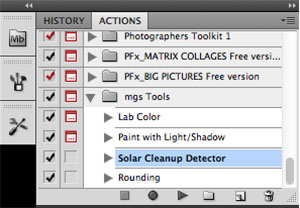
Because it simply takes advantage of the Polar Coordinates filter in Photoshop, I wrote a quick action to execute the filters in the right order.  I could not find an effective way to produce the square image.  So I did not include that in the action.

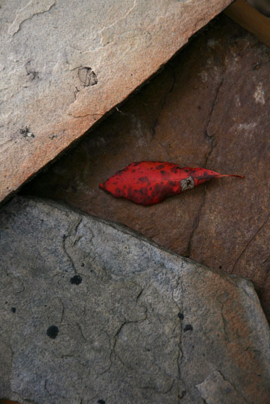
This technique allows you to take an image like this:

chicago-2014-32-Edit_1024
Harris Theater at Millennium Park

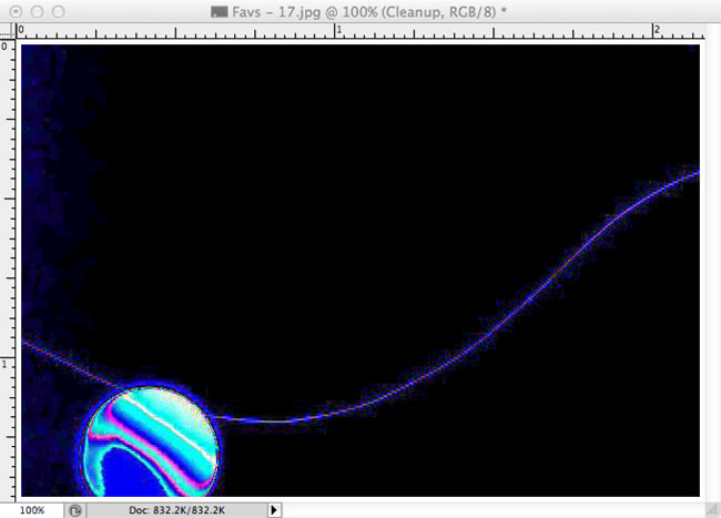
And Rounding it to produce an image like this:

Rounding Image of Millennium Park


The action takes only seconds to run, even on full-size images.  It is included in my Tools Action set.

The technique is simple, using the Polar Coordinates filter by doing the following:

polar-to-rectangular for Rounding
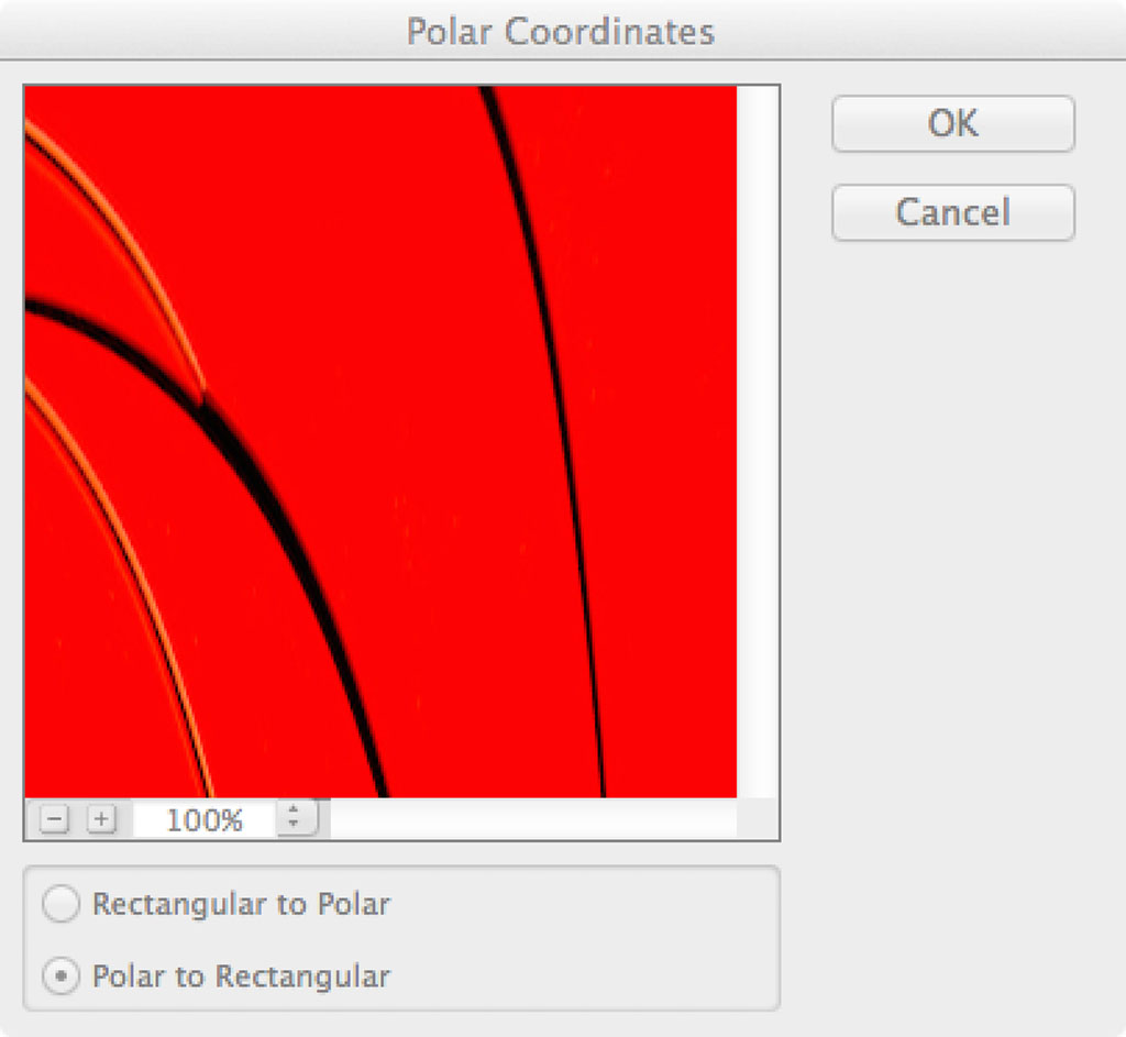
Convert the image using Polar to Rectangular coordinates:

  1. Filter -> Distort -> Polar Coordinates…
  2. Select Polar to Rectuangular
  3. Press OK

Rotate the image 180°:

  1. Image -> Image Rotation -> 180°

rectangular-to-polar for Rounding
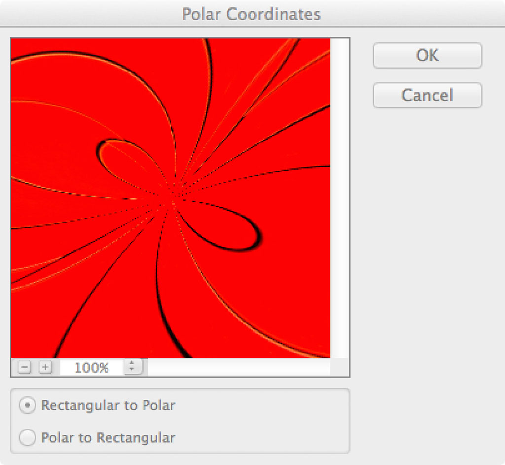
Convert the image using Rectangular to Polar coordinates:

  1. Filter -> Distort -> Polar Coordinates…
  2. Select Rectangular to Polar
  3. Press OK

For my images, I prefer a square format because it makes the image more symmetrical.  This is an effect that I continue to strive for, despite the fact that it can be considered a static composition.

resize
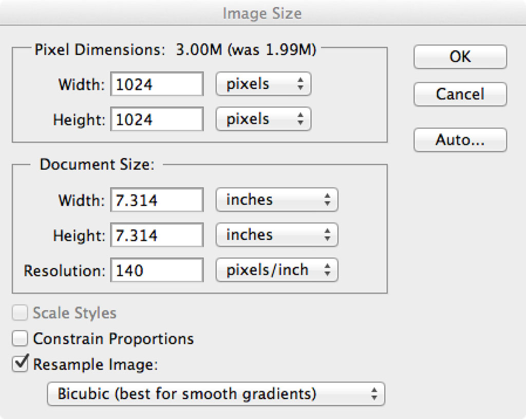
Create a square format:

  1. Image -> Image Size…
  2. Uncheck Constrain Proportions
  3. Set a Width that is equal to the Height
  4. Press OK

Of course with the action it is a simple press of the Run button to produced the Rounding image.

If you are looking for something artistic to do on those cold winter days this could be the solution to your problem.  Because the action runs so quickly it is easy to try it on image, after image, after image.

If you decide to print one of these images, you may find that the circle created by the polar coordinates comes too close to the edge of the print and you can’t matte it without covering part of the circle.

To resolve this problem, use the eyedropper tool to select the color of one of the smooth corners of the image.  Then you can extend the canvas by 10% using the foreground color (just selected by the eyedropper tool).  The extended canvas will be transparent, since it matches the edges of the image.


Categories
Actions Photoshop Technical Techniques

New Actions as Editing Tools

I was reading some blogs about photography this past week and ran across this article with a unique and effective tool for identifying editing flaws, particularly in smooth texture areas.

The technique was not complicated, so I wrote an action to create the layers.  I included this technique in a Tools Action along with some tools that I’ve written about before and will write about in the future.

To use this action you need to import the action into Photoshop.  Once it is imported you can expand the “mgs Tools” folder in the Actions panel, select the Solar Cleanup Detector.  Just press the run button “›” and it will create the two layers.

Solar Cleanup

The top layer will be a Solar Cleanup Detector which consists of the absurd Curves layer.  The selected layer below that named Cleanup is where you can use the Clone Brush or Healing Tool to make edits.  Like the original article, you need to choose sampling from Current and Below.

layers

Your image will likely look terrible with this effect turned on, however even minor variations, like the left edge of the image below, can be identified.  You do not have to disable the Solar Cleanup Detector while you are editing on the Cleanup layer, so you can see how effective your edits are while you are working.

solarized_image

Once your edits are complete you can disable or delete the Solar Cleanup Detector layer and save your edited image.

In the future I’ll provide more details on the other tools included in this package, like the Lab Color and Rounding actions.

chicago-2014-32-Edit_polar
Rounding Action Effect Copyright © 2015 All rights reserved
Note:  Some of my actions will automatically flatten your layers to reduce the variables while running the action.  If this is not something you want, make sure to save your edit as a new image.

Fstoppers is a photography/videography community started in 2010 by founders Patrick Hall and Lee Morris.  Their blog has become a regular read for me because it covers so many topics so well.

Categories
Actions Blog Photoshop Visual Design

Everyday Abstracts

I presented a brief version of an earlier presentation titled Everyday Abstracts at the National Institute of Health Camera Club this week.  I had the opportunity to judge their Abstract themed competition on the same night and I was very impressed by both the quality and breadth of their work.  I was also pleased with their patience, as my early comments were so long that I made it a VERY late night for everyone.

Photoshop Actions

reverse-4After the presentation portion of evening, several people had requested a copy of the presentation, which I promised to post here on my website so that people could easily access the presentation and the references to the Photoshop Actions that I mentioned during the presentation.  These actions are free to use and greatly simplify the repetitive tasks of creating montages from digital images.

The image at the right was the starting point and by applying a Reverse Montage effect, which was based on a technique that I was taught for slide film produced the featured image.  Taking 2 copies of the same image, both overexposed about 1 stop and putting them in the same slide mount, with one of them flipped over.

The affect of this treatment is highly saturated colors on a perfectly symmetrical composition.  As a by product, almost any image becomes an abstract.  This is one of my favorite techniques, and I will take many images of areas with strong graphic lines to produce an image based on line, shape and color.

Creating abstract photographs is something that I do routinely because it allows me to express some creativity and create something that comes completely from my mind.  Even with a “found abstract,” the way that the image is cropped, exposed and the depth of field all play an important and expressive role.

Categories
Blog Lightroom Photoshop Technical Techniques

Why We Should Care About Bit Depth

Bit-Depth ChartI see lots of questions about image bit depth, specifically about what is the “right” number of bits to use when capturing, editing and printing. And frankly, as far as I am concerned there is no one size fits all answer to this question.  As a general rule I like to use the largest color space possible (most number of bits), which means shooting Raw with loss less compression (12 or 14-bits in most cases), editing in 32-bit color spaces and printing/digital display in 8-bit.  In some ways Lightroom has made this easier on photographers by eliminating those questions of color space and using a 32-bit color space by default, then exporting to 8-bit.

To give you an idea why we, as photographers, should care about bit depth and always use the largest color space available I created this dramatization at the right.  This shows a gradient from pure black to pure red at varying numbers of bits.  The left column is 1-bit, where there are only two possible values.  Next to that is 2-bits, where 4 (22) colors are possible.  Next to that is 4-bits, where 16 (42) colors are possible, followed by 8-bits, where 256 (82) colors are possible.

The problem comes when you change an image from 8-bits to 4-bits, you get only 16 colors.  The 256 colors can never be recovered.  No matter how many adjustments, using whatever tools, you can never get those smooth gradations of color back into the image, and as you apply strong adjustments on an image that has been reduced, those smooth gradients turn into stronger contrasts.

Strong Levels AdjustmentIn this image, I took the upper half of the 4-bit color and applied an exceptionally strong levels adjustment, moving the black point to 127.  Rather than smoothly adjusting the color into 16 hues again, you get only 8 hues, just with stronger differences between each of the bands of color.

So if we ultimately print in 8-bit color spaces, why do we bother capturing and editing in larger color spaces?  Because capturing and editing in these large color spaces allows us to maintain the smoothest color transitions possible up until the final output.

It doesn’t really matter if you understand the science (or really mathematics) behind why to choose a specific color space, as long as you understand that using the largest available color space at each step will produce the best results, and that it is best to save a copy of the image in the larger color spaces as your “master” file, since it contains the most detailed information about the image.

Categories
Blogs Books Lightroom Photoshop Reference Techniques

Tim Grey

Tim Grey is responsible for accelerating my grasp of Photoshop.  He does a good job of identifying common issues that people have with photo processing in Adobe’s applications and writing well thought out answers to address the problems.  His Digital Darkroom Quarterly (now called Pixology) and his Ask Tim Grey newsletter provide easy to understand answers to questions you might not have even thought to ask.

Tim is an expert in Photoshop and Lightroom, with extremely good access to Adobe for questions that involve “why does this Photoshop filter work this way?”  He is also a published author, with several books on color management and digital darkroom workflow, including both Photoshop and Lightroom workflows.

Categories
Books Lightroom Photoshop Reference Websites

Scott Kelby

kelbytraining_titlelogoScott Kelby is quite the entrepreneur.  He turned a graphic arts business into a multi-million dollar per year enterprise, largely by working closely with Adobe to develop extensive training videos on nearly all aspects of photography and Adobe’s products all available at Kelby Training.

He also created the National Association of Photoshop Professionals, a professional organization of graphic designers and photographers where people share tips and effects that can be accomplished with Photoshop and its associated Creative Suite applications.

I initially purchased a few of the Kelby Training videos on DVD, which I loaned throughout my camera club for a couple of years.  This was shortly after Photoshop CS4 was released, and the CS3 videos all went on sale for 1/2 price.  But they convinced me that the video training would work for me, and that I had a tremendous amount still to learn.  For a couple of years I used their online training videos.  At $200 per year, it was about what I expected to pay for a 2 day seminar with no personal interaction.  This gave me access to the hundreds of videos that Kelby Training offers, 24 hours a day, 365 days a year.  Over those couple of years I learned a great deal about Photoshop, Camera Raw and Lightroom, as well as watching numerous photography oriented videos from people like Joe McNally, Frank Doorhof and Jay Maisel.

I have also read a number of Scott Kelby’s books, however I found them to be somewhat trivial for my taste.  Everything that I have read by Scott is a cookbook photography methodology.  That is, you are given a recipe of such and such a lens, at such aperture and exposure.  If you have a reasonable grasp of exposure, depth of field and focus I believe that you will find them too basic as well.

But give the Kelby Training site a spin, I think that you will find at least something that piques your fancy.

Categories
Actions Contest News Photoshop Technical Techniques

Judging at Charlottesville Camera Club

mirror-1_done
This is a Mirror Montage of an architectural detail of the Native American Museum.

I had the pleasure of getting invited to judge and speak at Charlottesville Camera Club on September 13, 2012.  Charlottesville is a bit of a drive from Northern Virginia, but I have been assured that it is worth the commute.

CCC has a competition and presentation on the same night, so I get to  judge the themed competition A SLICE OF SOMETHINGand I am also going to present a program titled “Montages, Interpreting Reality” in which I demonstrate some of the montage Photoshop Actions that I have developed and show how to change documentary photographs into something with a little more depth and feeling.

Categories
Actions Blog Photoshop Techniques

Painting with Light and Shadow

Gordon Campey referred me to an article by Mark Johnson that is in the Member’s area of the NAPP website that deals with painting light and shadow onto an image to give it more depth.  When combined with the Orton Effect, it can make that technique even more interesting.

With some input from Gordon I created a Painting with Light and Shadow action set.  I’ve got two actions in the set, one that simply creates a layer to lighten and layer to darken the images.  Select the layer mask of the appropriate layer and paint with White on that mask to lighten or darken an area of the image.

Not the greatest example, but I had this shot of a fender from a tricycle:

QG0F9953-Edit_pwl_800

To add some depth and contrast into this image, I applied the Paint with Light action, and painted Light onto the yellow areas and Shadow onto the blue, red and black areas.

QG0F9953-Edit_pwl_800

You can see how much darker and more saturated the reds and blues are, and the yellow becomes more yellow and less orange.

The Paint with Light action simply creates a layer with a Screen blend mode (makes things lighter) and a Multiply mode (makes things darker).  The layer masks are filled with black, so they do not apply any affect to the image.  By selecting the layer mask and painting with a soft brush with White, it will reveal some of the lighter color underneath.  I’ve seen a number of people use brushes with differing opacities, but I personally like a very low opacity, in the range of 20 – 30%.

I normally paint in Light first, then follow that up with Shadow, but a different approach may work for you.

I thought that I would show this one again, using this alternative to the Orton Effect technique from my earlier post.

freeman_wed_0181-Edit

To this one:

freeman_wed_0181-pwl_800

This action creates a blur layer, then adds a single Levels layer that will probably require adjustment in terms of both the White point and the mid-point sliders to achieve the desired neutral effect.  It creates the same Paint with Light and Paint with Shadow layers as the above action, and the same adjustments should be applied here.

In this image I needed to lighten the trees in the background, and darken the barn and the foreground bushes and flowers.

Categories
Blog Photoshop Techniques

Post Processing Adjustments

After running the Overlay and Orton Effect actions that I have created, there are still a number of adjustments that need to be made before the images are complete.

When I created the actions, I inserted some Levels layers that brighten each layer about 1 f/Stop.  This is a simple estimate and may not work well at all for a given image.

Take this image, which is pretty bright

overlay-1_main

I wanted to add some texture, so I added this cracked paint to give it a more worn feel:

overlay-1_texture

When I ran the Overlay action, it created a composite that looks like this:

overlay-1_raw

This adds the feel, but the color saturation is off and the strength of the texture is really more harsh than I wanted.  The action set the following levels:

overall_levels_default

Overall Levels

texture_levels_default

Texture Levels

background_adjust

Background Levels

So starting at the Background Levels, I started making adjustments.  Because I wanted more saturated color, I wanted to darken the Background Layer.  Moving the mid-point slider (grey triangle) to the right (lower numbers) will darken the image.

overlay-1_raw


background_adjust

Adjusting the Background Levels layer to a mid-point of 1.16 gives me slightly richer colors.

Next I make an adjustment to the Texture Levels to lighten the mid-point so that it will soften the texture a little.

overlay-1_text_adjust


texture_adjust

Moving the mid-point slider up to 1.89 lightens the texture and makes the effect just a little bit softer than the default.  The image is getting closer to where I want it, but it is just a little bit lighter than I wanted.

overlay-1_final


overall_adjust

Then slightly darkening the Overall Levels by moving the mid-point slider down to 0.94 and resetting the white-point slider to 229 finalizes the image for me.

The changes that I made in this image are pretty minor, but the end result is significantly better in my opinion.  The point is that some adjustment is not only desirable, but necessary.  The actions do not necessarily produce a finished image, but they significantly reduce the amount of work that you have to do with each image.

Categories
Actions Blog Photoshop Techniques

Orton Effect Action

I’ve been impressed with some of the Orton Effect montages that I’ve seen over the years.  I have seen many methods on the web for producing the effect in Photoshop, but was happiest with the method that André Gallant taught me when I was attending his workshop.

I was later introduced to another Canadian photographer, Gordon Campey, by a fellow student at the Freeman Patterson and Andre Gallant workshop.  Gordon introduced me to an NAPP  article that added a unique, but critical in my opinion, step to the creation of the Orton Effect.  That step was an increase in the size of the blurred layer of 1% – 2%.  It helps to give that larger “glow” in the overlay that so often occurs when creating this technique with slide film.  I have incorporated that transformation of the blurred layer into this action.

The Orton Effect allows you to take a relatively bland image like this:

orton-3 copy

Into something like this:

orton-3_done

There are two separate actions in the Action Set to account for Smart Objects.  In the default action I used a Smart Object so that you can adjust the Gaussian Blur that is applied to blurred image after the action is complete.  To account for Photoshop prior to CS3, I included a version that does not use the Smart Object, but it requires you to set the Gaussian Blur appropriately when you run the action.

After you run the action, you may need to set the White Point on the Levels 1 copy layer as it has a tendency to be pretty dark.  That is the only adjustment that I made to the above image.

I have to give credit to Michael Orton for creating this technique.  Although I have not read it yet, I recently purchased his book “Photographing Creative Landscapes, Simple Tools for Artistic Images and Enhanced Creativity”.  I look forward to reading it.