Categories
Blog Reference Video Websites

Vision and Perception

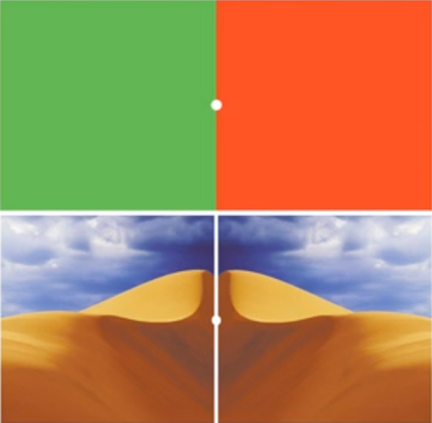
Ted Talks has some extremely good discussions that relate to photography.  One of my favorite videos there is by Beau Lotto and has to do with how we, as  humans, perceive color.  We are incapable of visualizing absolute color values, everything that we see is contextual.

Beau demonstrates how our brain compensates for color casts and changes in luminosity to make us see what we expect versus what is actually in front of us.  It can be frightening to see how easily the brain is convinced that we are seeing the same color when they are drastically different hues, or different tones when they are exactly the same.

The video is as fun as it is educational.

Categories
Exhibit News

Joseph Miller 3rd Annual Abstract Photography Exhibit . . .

is finally closed for entries.  I have been working hard with Joe to make sure that he has everything that he needs to complete the jurying process.  This year the exhibit was even more popular than in previous years.  The vast majority of images were uploaded through the website and paid through Paypal.

I have some breathing room for the short term now that I don’t have to monitor the entry process any longer.  For the next two weeks, it is all on Joe, then I get involved again.  Someone has to build the list of entries and get emails out to everyone who had an image juried into the exhibit.

From my look at the images that were entered, it is really stiff competition.  Joe has his work cut out for him in picking the lucky 125 or so images that will be on display.

For a look at the last two exhibits visit the NVACC website.

Categories
Blog

Judging at Loudoun Photo Club

You know that feeling you get in your gut when you enter your first photo club competition?  The knot in your stomach hearing the judge describe the out-of-focus foreground and the glaring, blown out hotspot? The frustration as the judge promptly throws your image out of the competition?  Well this month that guy is going to be me at the Loudoun Photo Club in Ashburn, Virginia.

Toward the end of last year I was invited to judge at the Loudoun Photo Club on March 28th for their themed competition Macro and Close-up.  I was pleased to see that they had added “Close-up” to the theme, since too few people have the actual gear to do macro work.

Technically macro means 1:1 to 10:1 in relation of the image on the sensor to the subject size.  To achieve this a lens must be capable of focusing extremely closely, or you can use a wide angle lens and a reversing ring.  Most photographers I know don’t have either in their camera bags.

Anyway, if you want to come hear me critique some images, I should be at The George Washington University Virginia Campus in Ashburn, VA at 7:00 pm on March 28th.

Categories
Blog Lightroom Photoshop Technical Techniques

Why We Should Care About Bit Depth

Bit-Depth ChartI see lots of questions about image bit depth, specifically about what is the “right” number of bits to use when capturing, editing and printing. And frankly, as far as I am concerned there is no one size fits all answer to this question.  As a general rule I like to use the largest color space possible (most number of bits), which means shooting Raw with loss less compression (12 or 14-bits in most cases), editing in 32-bit color spaces and printing/digital display in 8-bit.  In some ways Lightroom has made this easier on photographers by eliminating those questions of color space and using a 32-bit color space by default, then exporting to 8-bit.

To give you an idea why we, as photographers, should care about bit depth and always use the largest color space available I created this dramatization at the right.  This shows a gradient from pure black to pure red at varying numbers of bits.  The left column is 1-bit, where there are only two possible values.  Next to that is 2-bits, where 4 (22) colors are possible.  Next to that is 4-bits, where 16 (42) colors are possible, followed by 8-bits, where 256 (82) colors are possible.

The problem comes when you change an image from 8-bits to 4-bits, you get only 16 colors.  The 256 colors can never be recovered.  No matter how many adjustments, using whatever tools, you can never get those smooth gradations of color back into the image, and as you apply strong adjustments on an image that has been reduced, those smooth gradients turn into stronger contrasts.

Strong Levels AdjustmentIn this image, I took the upper half of the 4-bit color and applied an exceptionally strong levels adjustment, moving the black point to 127.  Rather than smoothly adjusting the color into 16 hues again, you get only 8 hues, just with stronger differences between each of the bands of color.

So if we ultimately print in 8-bit color spaces, why do we bother capturing and editing in larger color spaces?  Because capturing and editing in these large color spaces allows us to maintain the smoothest color transitions possible up until the final output.

It doesn’t really matter if you understand the science (or really mathematics) behind why to choose a specific color space, as long as you understand that using the largest available color space at each step will produce the best results, and that it is best to save a copy of the image in the larger color spaces as your “master” file, since it contains the most detailed information about the image.
Categories
Blogs Reference

Blogs I Read

Here is a list of photography blogs that I read on a regular basis.  Maybe not daily, but they are all linked to my  Reader so that I can easily read every post that they make.  Some post more frequently than others, and some post more on the art, business, technique or state of photography.

 
Blog Name Subject Matter Work Safe
Andy Beel Black & White Photography Yes
Art In Nature Beautiful Nature Photography Yes
Awake the Light Nature Photography with an Artistic Flair Yes
Beautiful Landscape Fine Art Photography, Business Yes
DIY Photography Do-It-Yourself photography accessories Yes
Fotoblur The Best of Fotoblur.com No
Inside Glamour The Business of Photography Yes
Joe McNally’s Blog Joe’s Life and Times Yes
Joshua Taylor Photography Gardens and Landscapes Yes
The Joy of Photography Matthew Jordan Smith’s Life Yes
Lighting Essential for Photographers Photography as a Business, Home of Project 52, a 52 Week Online Photography Business Course Yes
Photography Improvement Photography Technique Yes
Pretty Girl Shooter Glamour Photography No
The Slanted Lens Jay P. Morgan’s Blog on Lighting. Videos are VERY ad heavy Yes
Smoking Strobes Portraiture and Lighting No
Speedliting Syl Arena’s Blog on Canon Speedliting Yes
Strobist David Hobby’s Blog on Off-Camera Flash Yes
Zen Through The Lens Tuan Pham’s blog on Zen Insights and How They Relate to Photography Yes


Some of these, like Andy Beel, Joshua Taylor and Ed Knepley I read primarily because they are friends or acquaintances whose work I like and I read their blogs to keep up with them.  I also read a lot about lighting and portraiture, some of which includes nudes, like Pretty Girl Shooter and Smoking Strobes.  Read at your own risk.

Categories
Blogs Books Lightroom Photoshop Reference Techniques

Tim Grey

Tim Grey is responsible for accelerating my grasp of Photoshop.  He does a good job of identifying common issues that people have with photo processing in Adobe’s applications and writing well thought out answers to address the problems.  His Digital Darkroom Quarterly (now called Pixology) and his Ask Tim Grey newsletter provide easy to understand answers to questions you might not have even thought to ask.

Tim is an expert in Photoshop and Lightroom, with extremely good access to Adobe for questions that involve “why does this Photoshop filter work this way?”  He is also a published author, with several books on color management and digital darkroom workflow, including both Photoshop and Lightroom workflows.

Categories
Blogs Lighting Portrait Reference Video Workshops

Zack Arias

Zack is famous for his OneLight portraits.  I read about Zack in someone’s blog a long time ago and followed his blog for quite a while.

In this video from Creative Live, Zack discusses the relationship between flash power and aperture.

Zack and Creative Live have produced a series of videos that can be purchased based on his 3 day workshop.  Almost like being there, but you get the added flexibility to repeat any portion of the workshop that you didn’t quite catch, or that you are having difficulty grasping.

Categories
News Workshops

“Illuminating Creativity – A Photography Seminar”

I just received the following email from the Baltimore Camera Club:


Nationally acclaimed photographer John Paul Caponigro is conducting his unique one day photography seminar

“Illuminating Creativity – A Photography Seminar”
Saturday March 9, 2013 8:30 AM – 4:30 PM
Kelley Hall on the Goucher College Campus, Towson, MD
sponsored by the Baltimore Camera Club.

You can see more information at http://www.baltimorecameraclub.org/Caponigro_redirect.html

For more information please contact: Karen Messick at 410-337-2939 or karenskier AT aol DOT com

Information about John Paul Caponigro is available at:
http://www.johnpaulcaponigro.com/
http://en.wikipedia.org/wiki/John_Paul_Caponigro

You may or may not know, the BCC had scheduled John Paul last year, however he had to cancel at the last minute due to a family emergency. The BCC rescheduled him again this year.

Categories
Abstract Blog Visual Design

Abstract Photography

Image of Composition VIII by Wassily Kandinsky
Composition VIII – Wassily Kandinsky

For the longest time I had no appreciation for abstract art.  I could not understand what it was that people saw in it.  Certainly I was familiar with and even liked Wassily Kandinsky’s Composition VIII pictured above, but it didn’t have any real meaning for me.  I could not understand it.

Over the years my wife, a trained graphic artist and now high school science teacher, would try to convince me that I did not need to like something just because it was a “famous” piece of art.  And that just because I liked something, didn’t mean that I actually had to understand “why” I liked it.  It was OK to just appreciate the work that I liked and ignore the work that I didn’t.

CRW_1272_cropWith that foundation laid, when I met Joe Miller and was able to spend some time discussing photography, and that led to Joe’s preferred subject matter, abstract photography.  Joe was very patient with me, spending lots of time describing how lines, shapes, colors, textures and perspective all affect the way that we perceive a scene.  He spent a great deal of time explaining how Dave Carter, Joe’s longtime friend whom I met briefly before he passed away, would apply the psychological implications of visual design to his critiques of images.  Joe encouraged me to explore design-based, rather than subject-based, photography in a Portfolio Project for NVPS, for which I decided to work with the stained glass windows in Joe’s studio, but took all of the photographs in InfraRed using my converted Canon 10D.  The lack of color forced me to concentrate on the lines, tones and textures of the glass, however with the IR camera I got unexpected (for me) results.  Blues became translucent and bright, while reds became opaque and dark, frequently pure black.

All of this helped me to develop not only an appreciation of abstracts, but a greater appreciation of images in general.  It greatly improved my ability to abstract an image into its component shapes, which has improved my visual design.  I now find that I am framing images based on principles of visual design, even when I am shooting sporting events.

Categories
Reference Video

Dean Collins

Also known as the “Dean of Photography” was the very first person to present lighting in a way that I could grasp.  His explanations of 3 Dimensional Contrast lighting, describing specular, diffuse and shadow areas of the subject got me thinking in whole new ways about photography and how the light affects what we are seeing.

Sadly Dean was gone before I had ever heard of him, but his videos are still available from Software Cinema and I have watched a number of them.

His videos allowed me to develop new ideas about how I might light and shoot different subjects.  It was amazing to me how he would produce drastically different images outdoors by simply using a reflector and a scrim.  Subject on one side you get a high-key image, move to the other side and get a low-key image.

He also wrote a booklet about Do-It-Yourself scrims, reflectors and flash modifiers using schedule 40 PVC pipe called Tinker Tubes.  I have seen this booklet on the web, but it is copyrighted work so please do not download it illegally.  There are plenty of copy-cat productions on the web like this, but Dean’s designs are better, in my opinion.

It is well worth your time to watch more of his presentations, especially if you are trying to learn lighting and exposure.