Categories
Blog

An Abstract Photography Presentation at MPC

“Could you speak at our club about Abstract photography on <insert date here>?” is the question that I am hearing more and more frequently.  Clearly Joe Miller’s impact on our local area camera clubs is becoming more tangible.

McLean Photography Club

has invited me to speak at their club on Abstract photography and provide critiques of club members’ images on January 8, 2014.  Two other clubs invited me to do something similar the same week, with the same subject.  I believe that the cause of all this excitement over Abstract photography has a direct correlation with the annual Joseph Miller Abstract Photography Exhibit, which will be celebrating its 4th year in 2014.

As the popularity of that event has grown, so has interest in the programs that I had developed discussing abstract imagery and visual design.  As a reformed “hater” of abstract art I feel that I have a special relationship with abstracts.  And I try to help people understand the elements that make an abstract art, particularly as it relates to how lines, shapes colors, texture and perspective affect our perception of art.

Image of Composition VIII by Wassily Kandinsky
Composition VIII – Wassily Kandinsky

Ed Knepley has written several blog posts about abstract photography recently, he tells me that they do not attract nearly as many visitors as his posts on technique.  Ed and I have differing opinions about the use of post processing in photography, but the articles are all well written and persuasive.  In particular, Ed refers to a book written by Kandinsky in this post, of which I had never heard before,  Point and Line to Plane.

Kandinsky’s quote, “Objects damage pictures,” is a constant reminder to me that subjective imagery can be as effective as objective imagery.

So am I being pigeon holed into an Abstract Photographer, perhaps.  But I could think of a lot worse reputations to have.

Categories
Actions Blog Photoshop Visual Design

Everyday Abstracts

I presented a brief version of an earlier presentation titled Everyday Abstracts at the National Institute of Health Camera Club this week.  I had the opportunity to judge their Abstract themed competition on the same night and I was very impressed by both the quality and breadth of their work.  I was also pleased with their patience, as my early comments were so long that I made it a VERY late night for everyone.

Photoshop Actions

reverse-4After the presentation portion of evening, several people had requested a copy of the presentation, which I promised to post here on my website so that people could easily access the presentation and the references to the Photoshop Actions that I mentioned during the presentation.  These actions are free to use and greatly simplify the repetitive tasks of creating montages from digital images.

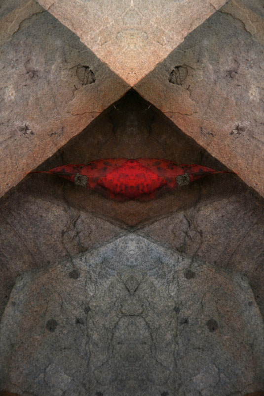
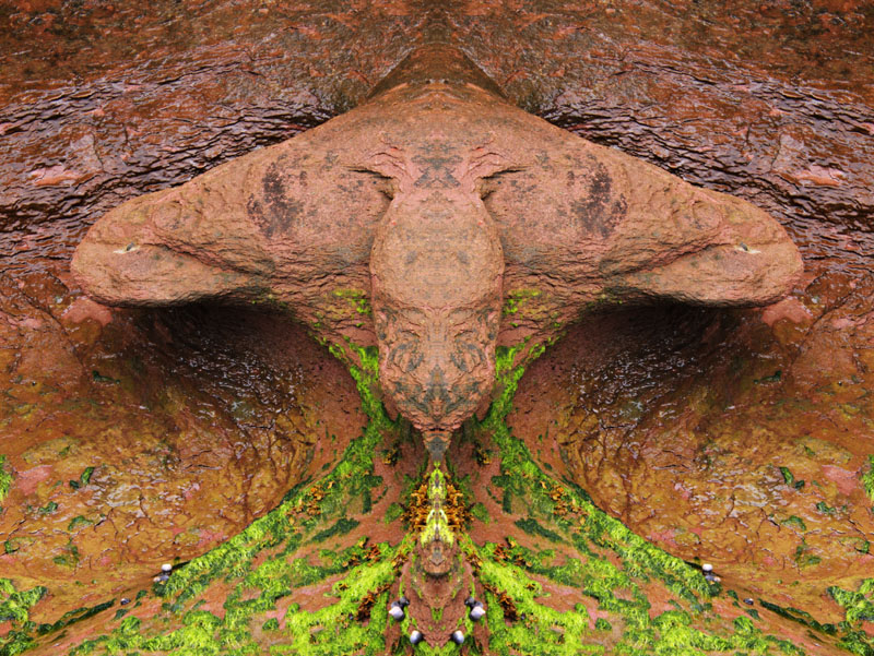
The image at the right was the starting point and by applying a Reverse Montage effect, which was based on a technique that I was taught for slide film produced the featured image.  Taking 2 copies of the same image, both overexposed about 1 stop and putting them in the same slide mount, with one of them flipped over.

The affect of this treatment is highly saturated colors on a perfectly symmetrical composition.  As a by product, almost any image becomes an abstract.  This is one of my favorite techniques, and I will take many images of areas with strong graphic lines to produce an image based on line, shape and color.

Creating abstract photographs is something that I do routinely because it allows me to express some creativity and create something that comes completely from my mind.  Even with a “found abstract,” the way that the image is cropped, exposed and the depth of field all play an important and expressive role.

Categories
Blog

Presenting at NIH Camera Club

Space ShotI will be giving a short presentation and judging at the National Institute of Health Camera Club on Tuesday, November 12 at 6:45 PM.  The presentation I will be giving is called Everyday Abstracts, and discusses some of the Hows as well as the Whys of my abstract photography.

It is my considered opinion that we, as photographers, spend far too much time discussing how to take photographs and far too little time on why we take photographs.  Part of the reason we do this is because it is easier to discuss the quantifiable values associated with our images than to relate our own feelings about them.  However I believe that the real reason we take photographs is emotional.  We are attracted to the subject matter and our photographs are an attempt to relate that emotional response to others.

When we take a photograph, we use composition, focus, depth of field and shutter speed in an attempt to convey that emotion.

In abstract photography, there is no strong subject matter to carry an image so we have to rely on tenants of visual design.  Lines, shapes, colors, textures and perspective must convey that feeling.

How

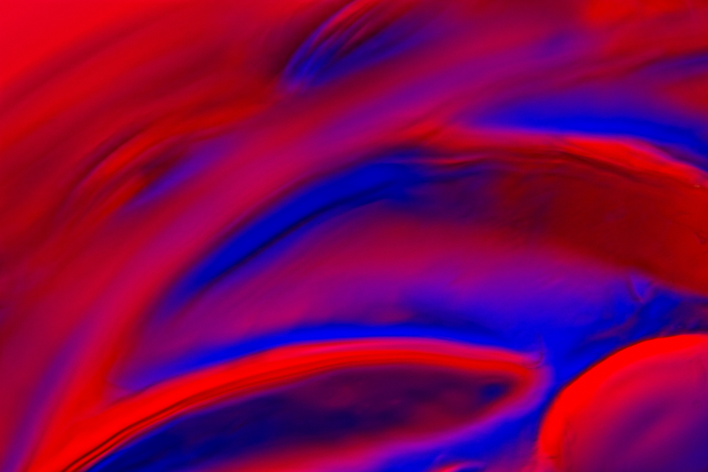
Both of the images associated with this post are [true] macro photographs of glass.  One was shot with colored gels, and the other in front of a computer monitor.  In both cases the colored light is projected through the glass and edges of the glass produce the refraction and create the lines, shapes and colors.

Why

But the why is that I find abstract, curved shapes very appealing.  I also like a contrast of warm and cool colors.  As I was taking these photographs, I specifically chose warm and cool, and I used curved lines, a shallow depth of field and soft focus to give the images a soft, ethereal glow rather than harsh, strong lines.  For these specific images, those techniques felt better to me than the sharply focused lines.

Abstract images typically do not have a true up, down, left or right.  We may orient them the way that we shot them, but there is nothing stopping us from rotating and/or flipping the images to produce a different feel.  There is no right way to orient them so we can do as we please.  For the blue and orange image, I recall that the champagne glass that I was shooting was actually upright, which indicates that I rotated the image 180°.  That orientation feels best to me for the following reasons:  The orange line goes from a broad base to a narrow peak; the curve rises up an over from the lower left to the upper right; and, the dark blue curve feels better lower in the picture space than it does higher.

In the end I believe that we all need to shoot images that make us happy.  If we can make others feel things in our photographs it is great, but it is a distant second to being personally satisfied with our own work.

Categories
Blog

Judging at the 6th Annual Claude Moore Park Photography Expo

Natural History Museum ElephantI had the honor of being one of a panel of three judges for the 6th Annual Claude Moore Park Photography Expo that was on display Saturday, 28 September 2013.

The images this year were really outstanding, so it was especially nice to have additional judges to discuss the images and get a different perspective, something that rarely happens in most competitions.  The monthly club competitions that I get to judge require that no one discuss the images with the judge to avoid any swaying of opinions.

This expo has four classes of entrants and five categories of images in all but one class, so 16 separate categories to judge.  Fortunately there were only about 230 images (a record for this exposition), so it didn’t take all afternoon to judge.  Also, we had plenty of room to spread out all of the images (for a given class/category) and view them side-by-side.  This helped make the evaluations much more effective.  We also used the sticker system, so everyone got to pick their favorite n images, quickly ranking them by the ones that everyone liked, then two or one.  So sometimes an image that I would have picked as the sole judge would end up not getting an award, but overall I think that the awards were given to more universally appealing images.

I’d like to thank Gerry D’Onofrio (Expo Coordinator), Nora May (Judge) and Lynn Ezell (Judge), Dora Ramirez (Gerry’s Better Half and Hostess Extraordinaire) and Joe Ellis (Expo Creator).  You all did a great job!

Categories
Blog

New Work at Nature Visions

Nature Visions 2013 LogoI’ve been away from the site for a while, but hope to be back to posting on a semi-regular basis.  The last few weeks my vocation has been taking up an inordinate amount of my time, and I accepted a volunteer role as the primary webmaster for the Nature Visions Mid Atlantic Photo Expo, a local nature photography exhibit that attracts hundreds of entries each year.

Updating the website was quite a bit of work, there are 13 presenters and 21 presentations that required updated pages/posts, tons of linkages to other websites and a tremendous number of functional fixes.  The theme that is being used is quite dated and created menus based on the page hierarchy, which meant the only posts were related to the blog.

I found code that allowed me to add the PHP code necessary to integrate the WordPress 3.x menus, which caused a Z-index issue that had the menu displaying below galleries and sliders on certain pages.  After I got that fixed for every browser to which I had easy access, someone else experienced the issue running a 64-bit version of Chrome (or at least Chrome running on a 64-bit version of Windows 7).

Also on the agenda was creating pages with lists of things like presenters and presentations.  Fortunately I found WP List Posts Shortcode that creates lists of posts by Category, and Posts by Tag that creates lists of posts by Tag(s).  These two plugins allowed me to simply categorize and tag presentations and presenter information, updating the relevant pages automatically.  I also stumbled upon an RSS feed plugin called RSS Multi Importer that allows us to import posts from the presenters’ RSS feeds and add them to the presenter’s page automatically.  Together I believe that these plugins make the site appear more professional, which is not bad for a non-profit organization.

Ultimately this is all part of my goal of paying to back to a community that has provided so much to me without reservation.

Categories
Blog

Formal Photography Education

Photography Degree LogoI was recently contacted by Photography Degree, a comprehensive collection of colleges and universities offering accredited degree programs in photography, so I thought that I would write something quick up for their website here.

Photography Degree provides a wonderful directory that can be filtered to assist you in finding the degree program that fits your needs.  You can quickly filter by online versus brick and mortar, state, type of degree, and field of study to narrow your search down to appropriate schools.

You can also find information on building your portfolio, finding a job, learning what classes you’ll take and what you will do on the job.  You’ll learn what to focus on to improve your photography, what the average pay is, and what the job outlook is for your chosen career field.

All for free!

Check out their website at: http://www.photographydegree.com

Categories
Blog

Judging the End-of-Year Competiton at GCC

I’ve been invited back to Gaithersburg Camera Club to judge their End-of-Year competition this year.  This will be my first EOY competition and I am really looking forward to it.  I will get more time to spend with the images, and I will not be required to critique each of the images in real time, the most stressful part of a monthly competition in my opinion.

This time I get to make comments on only the top three images in each category, which will be written down and read at the EOY banquet.  I believe this will be far less stressful for me and more beneficial to the members at the banquet.  Mainly because I will have time to think and formulate a more cohesive train of thought.  I will also be able to concentrate on why the image was chosen over the others, rather than justifying removing the image from competition as so often happens when judging monthly competitions.

Categories
Blog Reference Technical Techniques Video

The Movement of Light

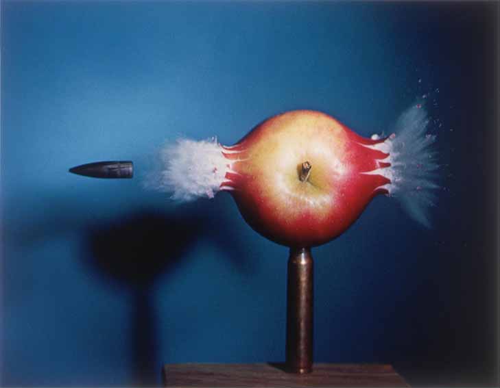
Ramesh Raskar presented a TED Talk about femto photography, or photography at a trillion frames per second.  Inspired by Harold Edgerton, the MIT professor who, in 1964, stopped a bullet as it passed through an apple using stop-motion photography, Ramesh decided to build a camera that could photograph light itself.  Ramesh’s camera is revolutionary in the same way that Edgerton’s photograph was, he is able to photograph a world that we have never seen before.

I don’t expect to able to go out and buy one of Ramesh’s cameras any time soon, but the possibilities are truly extraordinary.

Ramesh Raskar:  Imaging at a Trillion Frames per Second


Categories
Blog

Critiquing Images

My camera club, NVPS, has asked me to do an “anonymous critique” of some member images at our upcoming meeting on Tuesday, 9 April.  I prefer critiques to judging for a number of reasons, not the least of which is that I am not relied upon to make a qualitative judgement about whether this image is better than that image, something that I feel is largely in the eyes of the beholder and quite subjective.  Not that I don’t have an opinion, just that I know that my opinion is just that, an opinion.

Nonetheless, I find that judging and critiquing others’ work has helped me to be a far more critical self-editor.  I am better able to ignore my delight in the work that I put into creating an image and concentrate more on whether others may get the same feeling (or not).  Not that I do not still take banal and unimaginative photographs, I am just less likely to be showing them off than in the past.

Understanding the difference between a good image and a hard-earned image is one of the skills necessary for developing your photography beyond the ordinary in my opinion.

Categories
Blog Portrait Reference Video Websites

Making it All Look Easy

I’m frequently amazed by the way some photographers can make such a difficult shot appear to be simple. When I first saw this behind the scenes video of Joe McNally getting the environmental portrait of a guy changing a light bulb on the top of the TV antenna at the top of the Empire State Building, I thought it was such a simple idea.  It all looks easy but took three attempts on different days and a really novel idea from Joe on how to get the camera above the light.  Plus he is WAY up on top of one of the tallest structures in the world.  The picture was for a story that Joe was working on for National Geographic called the Power of Light.