 I will be giving a short presentation and judging at the National Institute of Health Camera Club on Tuesday, November 12 at 6:45 PM. The presentation I will be giving is called Everyday Abstracts, and discusses some of the Hows as well as the Whys of my abstract photography.
It is my considered opinion that we, as photographers, spend far too much time discussing how to take photographs and far too little time on why we take photographs. Part of the reason we do this is because it is easier to discuss the quantifiable values associated with our images than to relate our own feelings about them. However I believe that the real reason we take photographs is emotional. We are attracted to the subject matter and our photographs are an attempt to relate that emotional response to others.
When we take a photograph, we use composition, focus, depth of field and shutter speed in an attempt to convey that emotion.
In abstract photography, there is no strong subject matter to carry an image so we have to rely on tenants of visual design. Lines, shapes, colors, textures and perspective must convey that feeling.
How
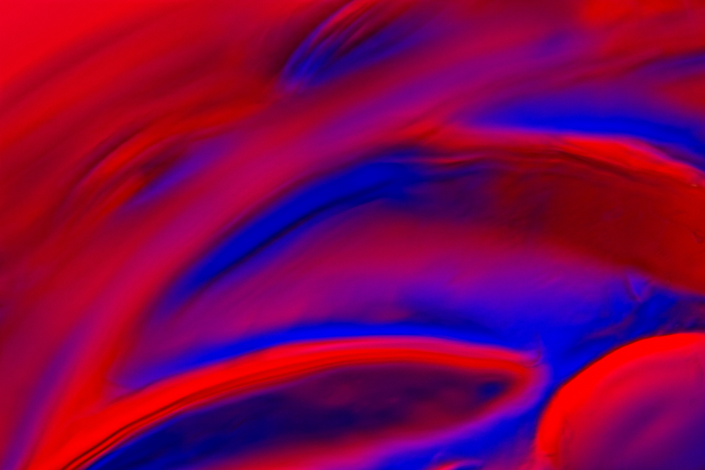
Both of the images associated with this post are [true] macro photographs of glass. One was shot with colored gels, and the other in front of a computer monitor. In both cases the colored light is projected through the glass and edges of the glass produce the refraction and create the lines, shapes and colors.
Why
But the why is that I find abstract, curved shapes very appealing. I also like a contrast of warm and cool colors. As I was taking these photographs, I specifically chose warm and cool, and I used curved lines, a shallow depth of field and soft focus to give the images a soft, ethereal glow rather than harsh, strong lines. For these specific images, those techniques felt better to me than the sharply focused lines.
Abstract images typically do not have a true up, down, left or right. We may orient them the way that we shot them, but there is nothing stopping us from rotating and/or flipping the images to produce a different feel. There is no right way to orient them so we can do as we please. For the blue and orange image, I recall that the champagne glass that I was shooting was actually upright, which indicates that I rotated the image 180°. That orientation feels best to me for the following reasons: The orange line goes from a broad base to a narrow peak; the curve rises up an over from the lower left to the upper right; and, the dark blue curve feels better lower in the picture space than it does higher.
In the end I believe that we all need to shoot images that make us happy. If we can make others feel things in our photographs it is great, but it is a distant second to being personally satisfied with our own work.

You must be logged in to post a comment.